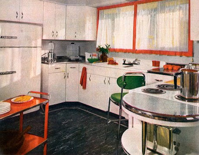
Mid-Century Modern Design!
Yancey and I have been in love with Mid-Century Modern design for some time. We’ve spent the better part of the last year remodeling our home with Mid-Century furniture, tableware, ashtrays, vintage Blenko and Viking decorative glass, and thrifted clothing. We’ve researched and storyboarded mid-century, interviewed our parents about the 50’s and 60’s, sketched out furniture and lamps for our own line of Mid-Century décor, and posted about it on this blog.
Mid-Century Modern was influenced by the modern aesthetic of Bauhaus from the 30’s and includes
Scandinavian or Danish Modern, in my mind. Honestly, although it is a recognized style, I’m having trouble finding a good definition on Wikipedia or in the larger Web. Most definitions just point to the work of Frank Lloyd Wright and other architects and modern real estate developers of the day like
Joseph Eichler. On the industrial design side, articles point toward the work of US designers like George Nelson and Charles and Ray Eames, among a long list of others.
From my chair, in terms of Home Decor, look for clean, modern lines, with unadorned surfaces i.e a lack of carvings and ornamentation. Mid-Century Modern, aka Mod or Retro, also has an elegant economy of materials like Bauhaus, organic shapes, the use of teak and walnut was popular, as well as experimental materials (in the 50’s and 60’s) like bent plywood chairs and plastic. Two-tiered end tables were popular, as were tension lamps, and geometric shapes in furniture and decoration.
Atomic styling was also popular, with the use of the atom in lamps and other décor. In terms of Danish Modern, also look for
soft sculptural lines,
graceful curves and
smooth tapered legs, often with
metal caps on the legs.
Woven fabrics were widely used in upholstery. The use of
cantilevered cases with recessed legs with stretchers is also a component of Mid-Century Modern style.
In the following slide show, I’ve used Yancey’s 3 clothing styles for the 60’s to separate roomscapes –
Classic Mid-Century, Mod, and Hippie. Hope you enjoy!
Shine On! Braxton
Classic Mid-Century Style. Mostly the Draper home and other residences rocked this styleway. Pulled from the 50's...
 |
| Not seeing much Mid-Century Modern here, just like Betty's home. |
 |
| Now we're seeing some Mid-Century Modern! |
 |
| Exotic |
 |
| Nice! |
 |
| Like the colors here - clean, modern space |
 |
| Vacation paradise? |
 |
| Cool built in booth - I think built ins are great for this period |
 |
| Great room |
 |
| Cool |
 |
| Pulling from 50's here - check out the dinette |
Now for Mod Style. My personal favorite. Most of the Office scenes and Pete's home rocked this styleway. A more up to date look...
 |
| Awesome! |
Hippie Styleway. Not represented in MadMen YET but certainly a part of the whole groovy 60's scene. For Don's children later on...
 |
| Your basic Hippie Domicile on wheels. When the van's a rocking, don't come a knocking :) |
 |
| Classic! |
 |
| Sophisticated and more established older Hippie? - Arguably Mod |
 |
| Reminds me of our Bohemian post, but spot-on Hippie |
 |
| The Revolutionary... |
 |
| The artist... |
 |
| People mover |


No comments:
Post a Comment